The Spectral Signature: Identifying Printing Techniques on Antique Postcards
There's a peculiar magic held within an antique postcard, a whisper of a past life clinging to its cardboard surface. It's not just the image of a bustling city street, frozen in time, nor the elegant script on the back, but something deeper: the ghostly fingerprint of the printing process itself. For those of us captivated by antique city postcards, learning to recognize these printing techniques isn't just about technical knowledge; it’s about appreciating the artistry, understanding the evolution of photographic reproduction, and connecting with the hands that brought those images into existence. I remember, as a young boy, poring over my grandfather's collection, mesmerized not just by the pictures of forgotten towns, but by the subtle differences in their appearance – the sharpness, the grain, the unique texture. He, a lifelong collector, didn't need to explain it; he simply let me observe, encouraging me to *see*.
The Dawn of Reproduction: Lithography and its Charm
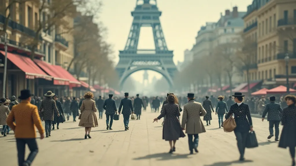
Before photography could be reliably translated onto a printing plate, lithography reigned supreme. Developed in the late 1700s, it’s a process of printing from a flat stone or metal plate, using grease-based inks that adhere to the treated surface. The image is drawn onto the stone with a greasy crayon, then chemically treated so that the greasy areas accept ink, while the rest repels it. Think of it as a reverse image of the original drawing. Early city postcards, particularly those from the 1890s and early 1900s, often bear the hallmarks of lithography. Often, a single lithograph might depict a cityscape documenting an era of rapid change, a glimpse into the vanishing skyline of a bygone age.
Identifying a lithographic print isn’t always straightforward. Look for a slightly grainy texture – a “stippled” look – particularly in areas of shadow. The colors tend to be softer, more muted, and less vibrant than later printing methods. Fine lines and imperfections are common, a testament to the handmade nature of the process. Often, you’re seeing the direct influence of the artist's hand, translated onto the printing plate. It’s a level of intimacy rarely found in later, more mechanized reproductions. The charm lies in these imperfections, these subtle reminders of the artistry involved. Consider that the artist was not simply copying a photograph (as would be possible later), but interpreting a scene, conveying a feeling, and creating an image.
The Photographic Revolution: Halftone and the Rise of Detail
The advent of photography dramatically changed the postcard landscape. Suddenly, accurate representations of cityscapes became readily available. But how to transfer a photographic image onto a printing plate? The answer was halftone engraving. This process breaks down a continuous-tone image into tiny dots of varying sizes – a halftone screen. The denser the dots, the darker the area appears. This allowed for a much greater level of detail and tonal range than lithography alone could achieve. Early halftone prints on postcards often feel quite sharp, but can also appear slightly "chalky" or "waxy" due to the limitations of the process at the time. The evolution of these photographic representations allowed viewers to witness the echoes in sepia, capturing fleeting moments of progress in urban environments.
Identifying halftone prints requires careful observation. Look for the subtle pattern of tiny dots when you examine the image closely, ideally under good lighting and with a magnifying glass. Areas of shadow will show denser dot patterns, while highlights will appear as sparse dots. The sharpness and clarity of the image are generally higher than with lithography, but there can be a loss of some of the artistic nuance.
The Jewel-Toned World of Chromolithography
Chromolithography takes the principles of lithography and multiplies them. It involves using multiple stones, each inked with a different color. These colors are then layered on top of each other to create a full-color image. This allowed for the production of truly stunning, jewel-toned cityscapes on postcards. Chromolithography flourished from the 1870s through the 30s and is a hallmark of the “Golden Age” of postcards.
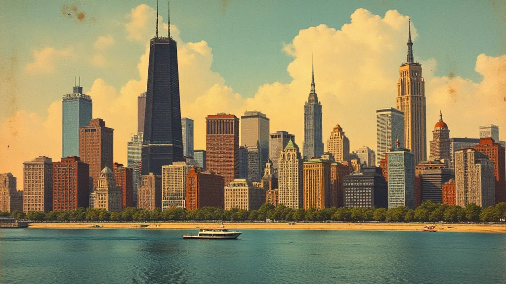
Distinguishing chromolithographs is relatively straightforward. The colours are typically vibrant and intense, showcasing a much wider palette than earlier methods. You might notice slight misregistration between colors (a slight offset or misalignment), particularly in areas of fine detail. These imperfections, far from detracting from the beauty of the postcard, serve as evidence of the complex process involved and the skill of the printer. The vibrancy and richness of colour are what truly set chromolithographs apart. A postcard of a Chicago skyline, bursting with hues of orange, gold, and deep blue, is a testament to the artistry of chromolithography.
Beyond the Basics: Photogravure and its Refinement
Photogravure (also known as heliogravure or photolithography) emerged later, in the late 1890s, and offered yet another level of refinement. It's a process that combines photography and engraving, producing prints with an exceptionally fine grain and incredible tonal range. Photogravure prints tend to have a softer look than halftone prints but retain a high level of detail. They are often considered the pinnacle of postcard printing technology.
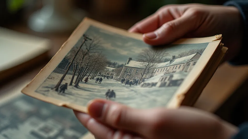
Identifying photogravure prints can be tricky. They lack the obvious dot patterns of halftone or the multiple stone impressions of chromolithography. The grain is very fine, almost imperceptible without magnification. Look for a velvety smoothness and a very subtle texture. Photogravures often exhibit a richer tonal range and a more nuanced appearance than other printing methods. Many "real photo" postcards (RPPCs), which are actually photographic prints, are produced using a variation of photogravure. The impact of these photogravure techniques allowed for fascinating shifts in the cartography of longing, acting as a temporal displacement device that transported viewers to another time and place.
A Collector's Eye: Valuation and Preservation
Understanding printing techniques isn't just an intellectual exercise for postcard collectors. It significantly impacts value. Early lithographs, particularly those from renowned artists, can be quite valuable. Chromolithographs, especially those in excellent condition and featuring desirable scenes, are also highly sought after. Photogravures, due to their technical complexity and beauty, often command premium prices.
Beyond value, recognizing the printing process informs preservation efforts. Lithographs, with their delicate surfaces, are susceptible to damage from light and handling. Chromolithographs, with their vibrant colours, can fade over time. Understanding these vulnerabilities allows collectors to take appropriate measures to protect their treasures. Proper storage in archival-quality sleeves and albums is crucial. Handling postcards with clean hands and avoiding direct sunlight can significantly extend their lifespan. My grandfather always said, "Treat each postcard as a piece of history, a fragment of a lost world, and it will reward you with its beauty for years to come." That wisdom, like the spectral signature of the printing process itself, remains deeply resonant. He appreciated how these images documented the geographer's palette, illustrating how urban topography underwent constant change.
Further Considerations: Examining the style and subject matter of a postcard, alongside its printing method, can deepen the appreciation for its historical context. For example, postcards depicting industrial scenes frequently utilized halftone or photogravure to capture intricate details of machinery and factory layouts. Moreover, the social and economic factors of the time played a crucial role in shaping the prevalence of specific printing techniques. The rise of mass production and the desire for affordable imagery influenced the widespread adoption of halftone and chromolithography, while more elaborate printing methods like photogravure remained a luxury reserved for special occasions.
The Role of Postcard Distribution Networks: The development of efficient postal networks was vital to the postcard boom. As mail became more accessible and affordable, postcards began circulating globally, connecting people across vast distances. This interconnectedness facilitated the spread of images and ideas, contributing to the homogenization of culture while also celebrating regional differences. The ability to send a tangible image from one place to another transformed the way people communicated and experienced the world.
Modern Interpretations and Digital Preservation: While physical postcards offer a unique window into the past, digital preservation is becoming increasingly important. Many archives and libraries are undertaking projects to scan and digitize postcard collections, making them accessible to researchers and enthusiasts worldwide. This ensures that these fragile pieces of history will survive for generations to come. Furthermore, contemporary artists and designers are often inspired by vintage postcards, creating modern interpretations that blend nostalgia with contemporary aesthetics.