The Typographical Tapestry: Deciphering Antique Postcard Typography and Layout
There’s a particular thrill that comes with holding an antique postcard. It’s more than just faded ink and brittle paper; it’s a portal to a vanished world. We pore over the image – the bustling streets, the imposing architecture – but often overlook a vital element of that historical snapshot: the typography. The fonts, the layout, the very look of the text speaks volumes about the era it hails from, revealing tastes, technological limitations, and a quiet artistry that’s often lost in the rush of modern design.
I remember discovering this fascination as a child, sifting through my grandmother's collection. She was an avid postcard collector, and her trove was a treasure. It wasn’t just the images of far-off places that captivated me; it was the unique lettering – bold Victorian script on a view of Chicago, a crisp, utilitarian sans-serif advertising a seaside resort. It felt like uncovering a secret code, a visual language whispering stories from the past.
Antique city postcards are often prized for their images, but the typography is a crucial element of their collectibility and historical significance. It’s a reflection of the prevailing aesthetic sensibilities and a direct consequence of the printing technologies available at the time. Understanding these nuances can elevate your collecting from mere accumulation to a truly informed appreciation.
The Victorian Era: A Flourish of Ornate Elegance
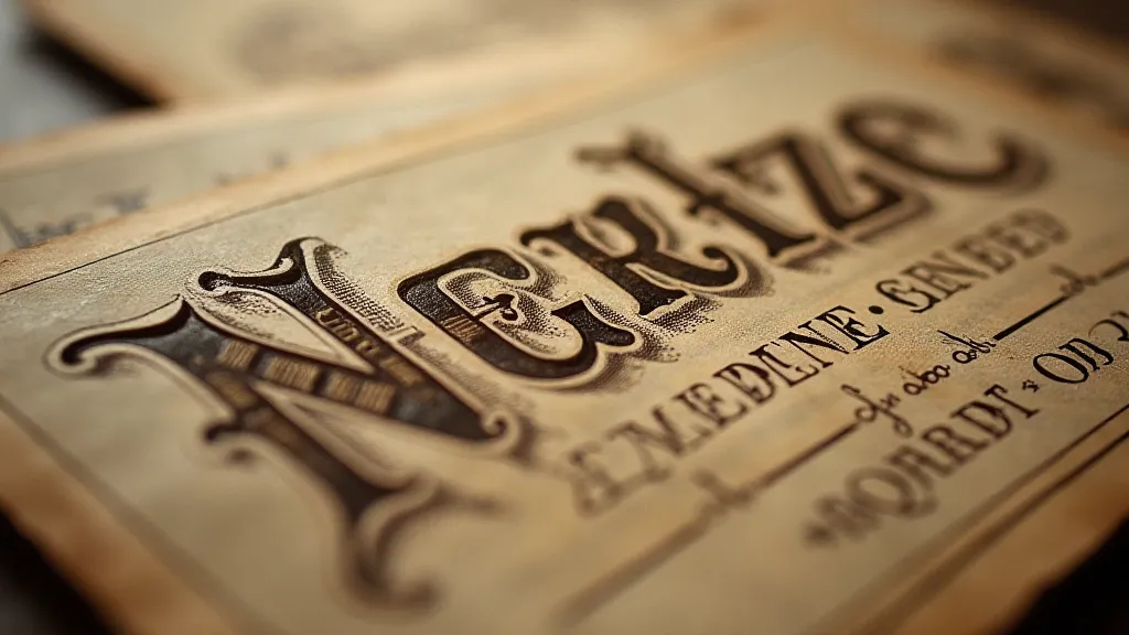
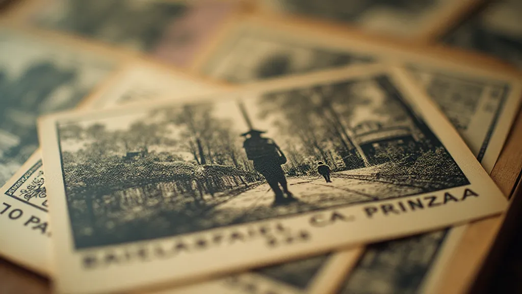
The late 19th and early 20th centuries, known as the Victorian era, were a golden age for elaborate typography. Think of ornate script fonts – Spencerian, Copperplate – flowing across the postcard in graceful curves. These weren't just fonts; they were artistic expressions. Printers strived to create a sense of grandeur and sophistication, often employing elaborate borders and decorative elements that further enhanced the visual impact.
The use of "shade" or “drop shadow” – where letters appear to be raised slightly from the paper – was incredibly common. While today we might consider it dated, in its time it conveyed a sense of quality and craftsmanship. Printers meticulously hand-lettered these cards, or used meticulously carved wood type, which added to the overall expense and exclusivity. A postcard with beautifully hand-lettered text, especially one featuring a rare location or event, can significantly increase in value.
Look for the prevalence of serifs – the small decorative strokes at the ends of letters. Serifs conveyed a sense of tradition and formality, perfectly aligned with the Victorian era's emphasis on propriety and established order. The sheer labor involved in producing these elaborate cards meant that they were often marketed towards a more affluent clientele – those who appreciated the artistry and were willing to pay for it. This attention to detail extended to the entire process; understanding the spectral signature of these early postcards, and the technologies used to create them, can add another dimension to your appreciation.
The Dawn of Modernism: Clean Lines and Functional Design
As the 20th century progressed, so did typography. The Art Nouveau movement, with its flowing lines and organic forms, gradually gave way to the streamlined aesthetics of Modernism. Suddenly, the elaborate swirls and flourishes began to feel…excessive. The focus shifted from ornate decoration to clear communication and a sense of efficiency.
Sans-serif fonts – like Futura and Helvetica (though these were later developments) – became increasingly popular. Their clean lines and lack of decorative serifs conveyed a sense of modernity and progress. These fonts were also easier to reproduce with the evolving printing technologies, making postcards more affordable and accessible to a wider audience. This period often saw a shift towards bolder, more direct advertising slogans and information.
Consider a postcard depicting a bustling railway station, a symbol of the burgeoning industrial age. The typography would likely be a strong, sans-serif font, perhaps in a dark color against a contrasting background. The emphasis would be on clarity and functionality, reflecting the era's focus on progress and efficiency. These cards often lacked the personalized touch of the earlier, hand-lettered examples. The people behind these images, often anonymous and working tirelessly to capture the spirit of a city, are fascinating in their own right; a deeper dive into the concrete dreamers who created these early cityscapes can reveal unexpected stories.
Printing Processes and Their Influence
The printing process itself heavily influenced the typography used on antique postcards. Early postcards were often letterpress printed – ink was pressed into the paper using raised type. This method limited the complexity of fonts and designs. The pressure and paper quality would leave a slight indentation on the front of the card, a subtle characteristic that can help identify its printing method.
The invention of lithography, a more versatile printing process, allowed for finer detail and a wider range of colors. This opened the door for more intricate typography and elaborate designs. Halftone techniques, which mimicked photographic images by using tiny dots of ink, also evolved during this period, further impacting the overall aesthetic.
Beyond the Font: Layout and Composition
Typography isn't just about the font itself; it's also about how it's arranged on the postcard. The placement of the text, the use of spacing, and the overall composition all contribute to the postcard’s visual impact. Early postcards often featured text aligned to the center or along a single edge, while later postcards experimented with more asymmetrical layouts.
The use of borders and decorative elements, as mentioned earlier, played a crucial role in framing the text and drawing the viewer’s eye. The size and weight of the font were also carefully considered to ensure readability and create a sense of hierarchy. The arrangement of the publisher's imprint, often tucked discreetly in a corner, also offers clues to the postcard's origin and rarity. The vibrant hues, however, were often short-lived, and the science behind their fading is a compelling subject in itself. Those interested in the technical aspects of how these images were created and how their colors have altered over time will find chromatic ghosts haunting the landscape of antique postcards.
Restoration and Appreciation: A Collector’s Perspective
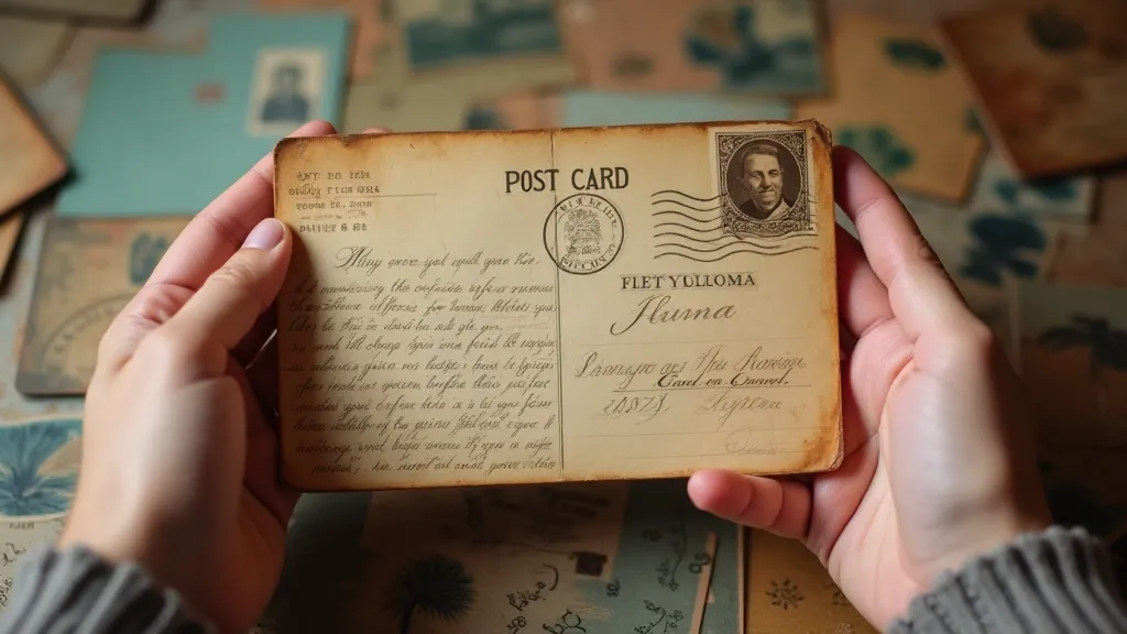
When collecting antique city postcards, paying attention to the typography can add another layer of appreciation and inform your assessment of their value. A postcard with a particularly beautiful or unusual font may be more desirable to collectors. The condition of the typography – whether the ink is faded, the lettering is cracked, or the paper is damaged – will also influence its value.
Restoring antique postcards is a delicate process. While some restoration techniques can improve the appearance of faded or damaged typography, it’s important to be mindful of preserving the postcard’s authenticity. Overly aggressive restoration can diminish its value and historical significance. Understanding the original printing methods and the nuances of the typography is essential for any collector or restorer. The act of deciding what constitutes a valuable piece requires intuition and expertise; a truly discerning collector possesses a special sixth sense that guides their choices. For those wanting to understand this skill, a deeper examination of the collector’s sixth sense can prove enlightening.
Ultimately, the study of typography on antique city postcards is a journey into the past—a chance to connect with the people who created and sent these glimpses of a bygone era. It’s a testament to the enduring power of visual communication and a reminder that even the simplest postcard can tell a rich and fascinating story.